
Watch store pro-tips: Building the ultimate display

A piece of history; information to building a professional watch storefront. Found in a magazine from 1953, written by Jean Durieu and illustrations from P.A. Perret.
To all owners with a brick and mortar store: Here are some 60 year old tips for presenting the timepieces to your customers without distractions, annoyances and stop making them feel like they enter a whorehouse.
Nowadays, the "appearance" of the store is of increasing importance. The storefront has one of the most important aspects, it is the precious domain which the alluring jewels, the most beautiful watches, would tempt the buyer. Its arrangement would deserve our full attention.
Here we are addressing those who own an old-fashioned establishment, those who plan to carry out their transformation projects soon, and finally those who are preparing to open a new store and hesitate about style, interior layout and dimensions.
This advice will help you be ahead of potential errors, we will tell the mistakes that others have already tackled. The examples of impractical, inelegant dispositions or arrangements that we show here have been seen in establishments built or recently transformed. And if sometimes it seems that our cartoonist exaggerates a bit, it is only to try to convince better.
Regarding the dimensions of the showcase, let us take into account a single principle: it must be proportioned to those of the items on display. The most common errors are: a showcase too high, a showcase too small or too low, a showcase too deep.
In a very tall window, twenty wall clocks can be hung, but your store would look like a bazaar and nothing produces a worse effect than a ten-foot vacuum above the watches and jewelry displayed on the floor of the window. If you want to mount a decoration, the height of the ceiling excludes any possibility of hanging the necessary items.

As for lighting, ceiling lamps are too far away to give enough light to the items on display, and hanging lamps would be unsightly.
It can be said that a narrow frame creates a better looking aesthetic, but a wall clock cannot be decently placed in a small shop window; thus diminishes the possibility or arranging a proper decoration and will make the display look too cramped.

Do you think a deep showcase is preferable? Without a doubt, the store owner hopes to be able to exhibit twice as many articles. But think of the impractical problem: it’s difficult displaying the items in the front, difficulty picking up an object, difficulty seeing an item placed at the back of the window from the outside. And you must also pay attention to location of the shop window.

Merchandise should be as close to the clientele as possible. Under no pretext, should the merchandise be moved away from the glass. Let's see, in the sketch above, the window in the middle: the inclined plane, represented in the display, had a company name or label in the window that this sketch inspired us. This misplaced advertising represents the loss of the best possible place to display the articles. In our third example, an architect's fantasy has created an obstacle to the direct view of the merchandise. Only the glass should separate the exhibited items from public view and nothing else.

It has been believed for quite some time that to attract customers it was necessary to display almost all the contents of the store in the window. On the contrary, experience has shown that the eye was lost when the assortment was too large because it was almost impossible to choose.
Now it is known that the the focuesd and elegant presentation of a selection of articles is much more effective. It is not necessary to multiply the exhibition surfaces with consoles, shelves, steps, supports of all kinds that, even made with modern and tasteful materials, give the shop window an old-fashioned and chaotic appearance.
In addition to their uselessness for sale, their poor aesthetic effect, the fixed window elements have other important drawbacks: Impossibility of changing the displayed items, impossibility of installing a decoration, and finally one more complications to access the articles.
This problem of access to the window display from inside the store also deserves special attention. We know of few establishments that have found a truly practical solution. Of course, it is difficult to obtain a setup that combines at the same time: the protection against dust... and thieves, that lets light through and hides the window from the view of customers who have entered the store (this to prevent them from seeing the wall clocks or decoration from behind), which allows you to take an item from the window in a few seconds or put it back just as quickly.
The usual mistake is the complication of access. Our drawing shows one of the most complicated systems we have ever seen. To get to this display, you have to: a) postion the sofa underneath the window b) open the curtains from the inside of the store c) open the doors d) open the curtains inside the window and finally climb on the bench to reach the merchandise.

The lighting of shop windows also include complicated problems. It is evident that the merchandise must be illuminated, but not the street, and avoid blinding passers-by. Neon and fluorescent tubes tend to give too violent lighting, denature the colors, which is very unpleasant for precious stones. The light must be concentrated and directed on the exhibited items. Care must be taken with any lighting system that diffuses light.


Under a decorative pretext, in certain establishments they have adopted large lamps and wall sconces. Why not to choose for these solutions, the arguments are: disproportion between the source of light and the merchandise, which then remains too cramped. It’s brightness diminishes under the brass and glass of the complicated lamps; the attention of the public is more attracted to the lamp, which occupies the entire space, than by the items on display; the light is generally of poor quality and the complication of the lamp causes shadows in the window. Lighting that takes up too much space diminishes or excludes the possibility of installing a decoration, and does not allow the ceiling to be used to hang the elements.

As for the façade, the greatest minimalism is recommended. The best advertising is your merchandise, that means, your shop windows. The minimalism, the good taste, will attract customers much more than any claim that is too flashy. Signs, paint on the windows, panels, are hardly compatible with the modern conception of the store and should only be used with the greatest discretion.
Another points that still deserves to be pointed out: under the pretext of luxury, many watchmakers feel obliged to use damask or patchwork fabrics for their curtains or shop window floors, on which the effect of exposed particles is greatly diminished. We cannot insist enough on the fact that watches and jewelry are much more enhanced on smooth backgrounds, and especially on matte materials. It is preferable to use a cheap fabric and change it frequently, than rich and expensive fabrics that have to last a long time and get dirty and dusty.

Finally, we will indicate the drawbacks of different materials and styles frequently used in watches and jewelry. In the first place, the mirrors that, although they multiply and expand, present the great drawback of distracting the full attention. In a mirror, the client and especially the weatlhy client usually look at themselves, and forget to look at the merchandise. Mirrors are cold, heavy and fragile; nothing can be hung or caught on them; with the mirrors you can see the wall clocks and the decorations from behind; they reflect the light unpleasantly, at night as during the day, the whole street can be seen in them.


The excess of gold, the marbles, the columns, frequently create a funeral-like environment.
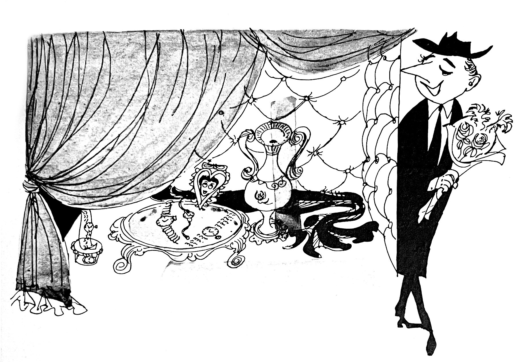
And one must also be wary of the « boudoir » type, with quilts, velvet curtains, lace, which oscillates between an antique shop window and a house of prostitution.
The sale of watches as it is conceived today does not conform to these styles, and the customer is more sensitive to an advertising argument in elegance, which not involves a dubious taste.
It is evident that, in the transformation of a store, the situation does not always allow doing what would be necessary. But there are fundamental mistakes that can always be avoided. To give a concrete continuation to this warning, we will dedicate our next article to the «ideal showcase». We will give one or more solutions to all the problems raised above, and we will offer you several studies of façades, since the article has been carried out in collaboration with an architect so that the ideas presented are perfectly achievable and can be fully successful in your new establishment.
I hope you enjoyed these, yet still relevant tips that could also be Googled in 5 minutes, and the work put in to making this a digitized article.
